Friday, 13 November 2009

Classification of our film

For our film, we would give it a classification of 12A. This is because our film will overall, have a very dark tone throughout, such as that in the film Persepolis which is also a 12A. Also there is mild violence in our film.

Tuesday, 10 November 2009

1.In what ways does your media product use, develop or challenge forms and conventions of real media products? (i.e. of film openings)
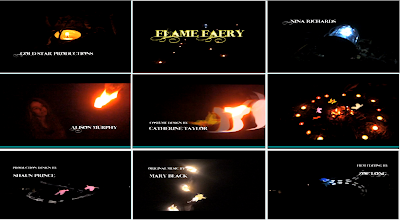

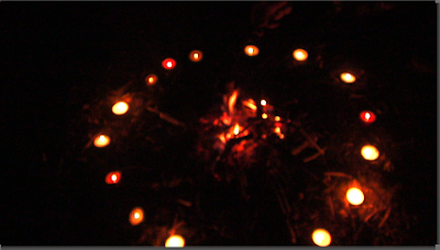
We used the shot of a candle as the first shot of our opening, because it gives the feeling that something magical is going to happen and draws the audience in. Also the candle right at the beginning helps to set the mood for the rest of the film.
The title of our film opening comes in quite early, so that it doesn't make our opening like a trailer. We made our main title a lot bigger than our other titles, and also we changed the main title colour to yellow, because this is a bright colour and it also symbalises the colour of fire.
The setting of our film opening is set in a small woods, because this is the typical place people would expect to find magical creatures, such as fairies.
We had our main character (Alison Murphy) dress up in a hippie style dress, to make her seem like she has an interest in fairies and magical creatures.
We set the main title in the middle of the screen, to make it stand out, whereas with the other titles we had them set in the corners of the screen. We used the style of font 'Inked God', because it looks magical.
We used quite a few different shots, such as long shots, close-ups and medium shots for our camerawork.
The opening suggests that the genre is going to be supernatural, because the setting is dark and the flickering candle at the beginning gives the feeling something magical is going to happen.
We used quite a few special effects in our opening, when we put the fairies in. My partner used the programme Auto-desk Maya, to make the fairies, which we then green screened onto our footage in Final Cut. Editing the fairies onto the footage was very time consuming, because we had to move each individual fairy using keyframe motion.
Our main character is introduced near the beginning, walking into the forest. When we did the shooting of our main character walking down the pathway, it was dark, so you can't see her face. The main title comes up before we see her face aswell. We first see her face when she comes into contact with the fairies.

Monday, 9 November 2009

2.How does your media product represent particular social groups?
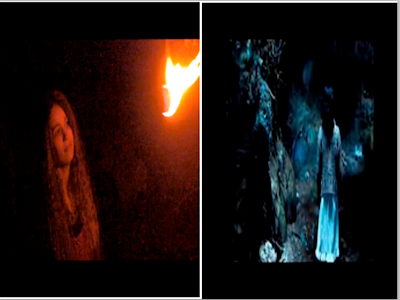


The similarities between our character and the character from the film 'Pan's Labyrinth' are that they are both wearing similar outfits, such as dresses. Also both characters are interested in magical creatures.
The differences between the two characters are that they are both from different time periods. Our main character is from now, whereas the character from 'Pan's Labyrinth' is from the war period.

3.What kind of media institution might distribute your media product and why?

Below is our director's style commentary

Sunday, 8 November 2009

4.Who would be the audience for your media product?
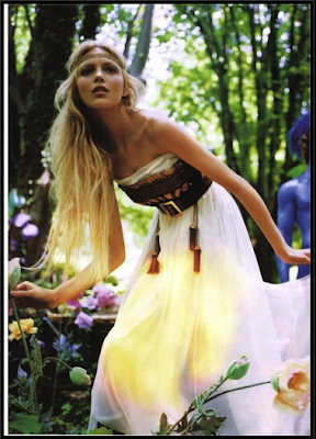

Target Audience for Our Movie

How old are they?
Teen- 17 years old

What gender are they?
Female

What are they called?
Kelly

How do they dress?
Hippie skirts and tops.

Where do they live?
In a quiet village, but near to a town with a cinema and plenty of shops.

What do they spend their money on?
Clothes, films, books..

Where do they watch films?
In the local cinema e.g The Arts Picture house. And DVD's

What kind of music do they like?
Classical music, alternative music

Do they buy music?
Yes

What do they do in their leisure time?
Write poetry, listen to music and watch films

How much TV do they watch?
They rarely ever watch TV, because they prefer films.

What is their favourite film?
Pan's Labyrinth

Do they play video games?
Very rarely


Saturday, 7 November 2009

5.How did you attract/address your audience?

6.What have you learnt about technologies from the process of constructing this product?

Above is a screen grab of an annotated picture of all the technical equipment we used for our film opening.


We used several different computer programmes and internet sites to help with our opening sequence.
Below are some screen grabs of the different programmes/sites we used.

Youtube

Vimeo

Photoshop

Blogger

Final Cut Express

Flickr

Garageband


7.Looking back at your preliminary task (the continuity editing task), what do you feel you have learnt in the progression from it to full product?
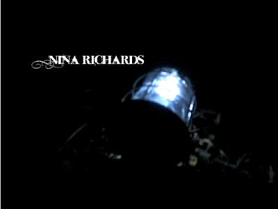
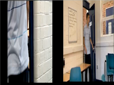
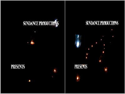

Above are three screen grabs. Two are close-ups from our opening sequence and one is also a close-up, which is from our continuity task.


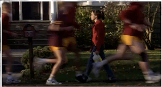
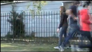
Above are two split screens. One is from our opening sequence, where the character walks down the pathway. The second one is from our continuity task that we did a while ago. Both of these split screens use the same match on action shot.

Friday, 6 November 2009

Final editing of our opening

Above is a print screen of our editing.


This is a screen grab of our editing of our fairies onto the glow poi.

Thursday, 5 November 2009

Opening Evening Ident


In groups, we had to make an ident for Creative and Media, for Opening Evening. I worked with Charna, Ali and Alex on the ident. We used lego, and the programme iStopMotion to do our ident. I also made the soundtrack for our ident.

Wednesday, 4 November 2009

Creative risks whilst doing the opening sequence project

We had to use fire on our opening sequence, such as the bonfire and the fire juggling, and using the fire as a fairy.
The risks were that we could have set fire to things and burnt ourselves. But we didn't have any problems with these risks.

Another risk we encountered, was when we had to do the filming in the dark. We didn't think this would work very well, but the darkness meant the fire stood out better, and we originally wanted it to be set at night anyway. We also had the help of Kirk, who was there with us when we filmed the bonfire scenes. This was good as he has already had lots of experience with the cameras.

Tuesday, 3 November 2009

Screengrabs from our editing
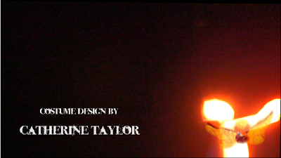


Above are some screengrabs from our opening sequence. We have superimposed some fairies onto the flames, which Charna made on the programme Autodesk Maya.

Below are the two videos that Charna put onto Vimeo. We used both of the videos in Final Cut.


Wednesday, 28 October 2009

Feedback on Sven and Jahmal's opening sequence

L3 - GROUP 7 (Jahmal & Sven) Film Opening Rough Cut from cmdiploma on Vimeo.


1.What are the strengths of the work?
There are a range of different shots used, and angles. I liked the part of the sequence where the two characters pass each other in slow motion.

2. What are the weaknesses of the work?
There is no sound or titles. Also there is no dialogue, so the viewer does not really know what is happening.

3.What should be changed?
None of the footage needs to be changed.

4.What is still to be done? e.g titles, sound, visuals
Sound and titles still need to be done.

Mine and Charna's rough-cut of our opening sequence

L3 - GROUP 6 (Sophie & Charna) Film Opening Rough Cut from cmdiploma on Vimeo.


After we had finished our rough-cuts, they were shown to the rest of the class, so we could have some feedback on them about what were the strengths and what were the weaknesses with our film opening. I think the piece of music in the middle of the rough-cut, is suited best to our opening, because it is mysterious and eerie, which helps set the scene.

1. What did people rate as the strengths of the work?

The shots and angles give a full view of the frame. The dark background works well with the bright fire and how the titles are positioned.

2. What did the people rate as weaknesses?

The music has not been timed very well with each shot, doesn't fit in with the plot of the film. The opening looks more like a trailer, because of the layout and the order of the titles.

3. What do you intend to change?

Change the music, because it doesn't fit the opening. maybe put dialogue in, so people understand what is going on.

4. What is still to be done? e.g titles, sound, visuals

Change it slightly to make it look and feel like an opening. Don't need to add anything else

Tuesday, 20 October 2009

Screen grabs from our opening


Above, are 4 screen grabs, with titles on, from our opening sequence. I think the titles work well, because they are white and the footage is dark because it is set at night. I also think the font works well, because it is sort of fairyish.

Editing our opening sequence


Above is a screen grab of the editing of our opening sequence.

Monday, 19 October 2009

Reflecting back on the filming for our opening sequence


We had to draw a picture of what we thought went well when we did our shooting. I drew a picture of the camera on the tripod, because I liked setting up the camera and getting all the shots set up right.

Friday, 16 October 2009

Similarities continued


This is a screen-grab from Torchwood- Small Worlds, which shows the fairies. Also our opening is similar to Torchwood, because we set our opening in a small woods, similar to the one above.

Similarities between our opening sequence and Torchwood

Here is the clip from Torchwood- Small Worlds.
The similarities between our opening and Torchwood is that both of the clips contain fairies.
For our sequence we have used fire,whereas in Torchwood there isn't fire.

Editing of our footage so far


We have started editing some of our footage, but we decided to take the dialogue parts out, because we thought that the dialogue didn't really make it seem like an opening sequence. For our titles we have decided to use the font 'Inked God' which is shown further down in a font board. Above are some screengrabs of our footage.

Thursday, 15 October 2009

Shooting on Tuesday 13th October

On Tuesday, we started our filming for our opening sequence. We used a small woods near Charna's house to do the shooting. We went in the lesson, to Charna's house to drop off the props and set up the tent in the woods, so we would be ready to shoot straight after college. We were going to shoot in daylight and then use different effects in Final Cut to make the footage seem like it was taken in the dark, but by the time all our actors had arrived it was dark anyway, so we benefited from that and don't have to worry about using the effects in Final Cut. We managed to shoot all our dialogue in the woods in that one evening.

The cast:
  • Character 1: Me
  • Character2: Charna's brother, Adam
  • Character 3: Kirk
  • The girl: Alison (brought a dress to wear, that would make her look more like how we wanted the character to look.

Props:
  • A tent
  • Fire wood
  • Lighter
  • Marshmallows
  • String
  • Fire wick
  • Wet blanket (for safety)
  • Newspaper
  • Lantern
Dialogue:

Sophie: So what if there is something in these woods? what will we do?


Adam: Listen, that girl just ran away it has nothing to do with these woods.


Kirk: Yeah and, we are here now, so we might as well just enjoy it.


Sophie: Yeah suppose your right.


Sophie: Are you alright over there?


Alison: Huh!? yeah I'm fine.


Sophie: you seemed a bit away with the fairies thats all.


Adam: (LAUGHS) so anyway were running low on firewood any volunteers to go get some.


Sophie: No.


Alison: (SIGHS) I will go and get it.


My Opie


This is my Opie, which I made in using Photoshop. I took a picture of myself and then made it into a cartoon of me. I used the pen tool to go around features, such as my hair and shoulders and then filled them in with colour, so that it resembled me.

Tuesday, 13 October 2009

Greenscreen activity

For this exercise, Jahmal was on a treadmill, in front of a greenscreen and then filmed. We also took a picture of Long Road and turned it into a cartoon. I then took the footage and edited it in Final Cut to make it look like Jahmal is moving across the screen in front of the college.

Test footage for night time scenes

Monday, 12 October 2009

Forward planning for Tuesday 13th October

Tomorrow morning, we will be at Coleridge, where we will start shooting for our opening sequence. We are going to do part of the filming, because we will not be able to use all the actors we need, because it is in college time. Hopefully we are going to be shooting off the Coleridge site, because we need to shoot in a woods for the camping scene. We are going to Cherry Hinton Hall, to use the woods there, and also this place is only 10 minutes away from the Coleridge campus. We have two lessons to shoot some of our material.


Timeline for Edward Scissorhands


This is my timeline for the film opening of Edward Scissorhands. I wrote when the different titles came in and when they faded out.

Our Animatic


This is mine and Charna's animatic, which is a moving storyboard. We took pictures of each of our different frames and put them in Final Cut, so we could make them into our animatic. I think we would have been able to put some music on our animatic, but we didn't have enough time to.

Sunday, 11 October 2009

Feedback

You need to upload the photo of your timeline

Friday, 9 October 2009

Opening title sequence from 'Edward Scissorhands'


My Ident

L3 SOPHIE (Gold Star Productions) IDENT from cmdiploma on Vimeo.


This is my finished ident, I done this by using Final Cut. I got an image of a star from google images and then in Final Cut I animated it and then I used Garageband to make my own music for my ident, which I then imported into Final Cut.

Tuesday, 6 October 2009

Test opening titles
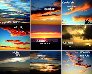


For this task, we had to use photoshop to make a contact sheet of what our opening titles may look like. We took 9 images from Google and dragged them onto a grid. Then we put on the different titles and used two different fonts, such as 'Angelic War' for the names of people and 'Apple Symbols' for the jobs that the people do in the film.

Ideas for the opening sequence

Our ideas for the opening sequence are fusing together both mine and Charna's supernatural thriller ideas. We have decided that we want to have a girl going missing and she ends up in a woods and encounters a strange light which she follows further into the woods. It leads her to a clearing in the woods.

Sunday, 4 October 2009

Feedback

I'm really impressed with how your blog is coming along- well done!

Friday, 2 October 2009

Film pitches

Brief 1- A mainstream action film that will appeal to 15-25yr old males.
(Based on a 'fictional' comic book)

My brief- An action film, where a man comes into contact with some poisoned food, which transforms him into a superhero.

Brief 2- A supernatural thriller that will appeal to female audiences
(An international co-production)

My brief- A thrilling movie, where two girls go off out and end up mysteriously disappearing and cannot be found anywhere.

Brief 3- An independent movie featuring a young protagonist
(Financed through regional funding)

My brief- A young boy runs away from his home in London, and ends up having to fend for himself.

Brief 4- An animated feature to appeal to adult audiences
(Based on a 'fictional' novel)

My brief- A man becomes obssessed with dead people and goes on a rampage, killing anyone he sees.

Fonts

Mood Board

Credits for Opening Sequence

1. A Long Road Film presents
2. Gold Star Productions
3. Sundance Productions
4. (Cast) Jerry Richards
5. (Cast) Alice Williams
6. (Cast) Sandra Peters
7. Costume Design by Catherine Taylor
8. Art Direction by Amy Crowe
9. Production Design by Shaun Prince
10. Casting by Harry Barton
11. Film Editing by Zoe Long
12. Cinematography by Jason Hartley
13. Original Music by Mary Black
14. Produced by Lance Green
15. Directed by Edward James
16. Main Title

Preliminary task


For this task, we had to work in groups of four and come up with a short clip following some rules we were given, such as 180 degree rule and close-ups. We had to do a shot of the character 1, walking along a corridor, and then a close-up of them opening a door. We then had to do a shot from inside the room, of character 1 entering. Lastly we had to do the 180 degree rule, where the two characters had a conversation.

Thursday, 1 October 2009

My video production logo


This is my video production logo. I chose to have the star placed on a black background, to make it stand out. Also with my writing, I wanted it to be gold over the star and then white over the black background. I used photoshop to design my logo and used the brush tool, to paint in the white on my writing, I think I have done quite well with this design, and I am going to use Final Cut to animate it and also I am hopefully going to add some music.

Monday, 28 September 2009

Feedback

good start on q.5 but needs more. go into the 'edit posts' option and you will see you have several half done there- you need to tidy this element up. Juno stuff is good!

Sunday, 27 September 2009

Case study of an opening sequence

In the film opening for the terminator, there is no action which suggests to the viewer that the film is going to be thrilling, so they will watch it. The title font is similar to that of an old computer or typewriter, which suggests that the film is going to be a sci-fi. The actors who play the leading roles in the film, are listed first and then the director, editor and director of photography are listed after.

Original Juno opening sequence

The original Juno sequence

Screengrab from the original sequence


Screengrab from our sequence

I think our group did quite well trying to re-create the Juno opening sequence. We wrote down what angles the camera would need to be at, and where the character needed to be in each shot, to make our sequence very similar to the original. I think that this was very effective.

Wednesday, 23 September 2009

How we did our opening sequence

We spent last Tuesday (15th) planning how we were going to do our opening sequence for our version of Juno, by drawing a storyboard, writing down all the different camera angles and what props we would need, i.e juice carton, skateboard,etc. We then shot the footage on Friday, ready for us to edit this Tuesday. We used the programme 'Final Cut' to edit our footage, whilst also learning more new techniques, such as how to zoom in on a shot, how to delete the audio that was with the footage so it didn't come up on our final video. We had to shoot all of our material on the Coleridge grounds, because we couldn't take the cameras offsite due to insurance, so we found shooting scenes such as the part where the girl crosses the road and when she walks past a shop quite difficult, but we managed to improvise and use different areas of the school grounds.
I think that our opening sequence came out quite well. We did have some problems with our footage, such as one of the shots we needed to use was over exposed, but we needed to use it. Our sequence doesn't have any titles on it and I think if we had been able to have a little extra time on editing our footage, we could have put some in, but overall I think both me and Liam did really well with our editing, especially seeing as neither of us had used 'Final Cut' before.

Monday, 21 September 2009

Feedback

Your points about the films you looked at are very good. For the post on Shifty, you need to say more about how the moodboard task worked and how it was based on a particular scene and trying to give a sense of atmosphere from that. Later you will be creating moodboards for your own project ideas.

Pete

Saturday, 19 September 2009

Student film opening

I went on Youtube, but this time I searched for some film openings by students at Long Road. I found one called 'Kidnapped'. I thought this opening was very good, it kept me gripped throughout, and it ended on a cliff-hanger. This made me want to see more.

Film opening on Youtube

I went on Youtube and looked at the film opening for the film, 'Blade'. I found this opening interesting, because at the beginning the lighting in the club is dark and the characters shown right at the beginning of the clip, suggest that something bad is going to happen. The colour of the writing of the titles, red, is the same colour as blood, which is then shown later on in the clip coming out of the sprinklers.

Thursday, 17 September 2009

Postcard design
Today, we had to design our own logo for creative and media. We did this in photoshop, and used various different tools. For my logo, I chose two images and changed the opacity of one, so that the two images were faded together. I then put text on to my image, and changed the size, font, colours and position of my text. I think my image turned out very much how I intended it to.

Wednesday, 16 September 2009

Using Final Cut

Also on Tuesday while we were at Coleridge, we learnt how to the use some of the features of 'Final Cut'. We learnt how to fade two clips together, also how to add text and how to position it, what fonts and colours and also sizes. I think we did quite well with our video we made, especially seeing as it was the first time I had used 'Final Cut'.

City opening sequence

On Tuesday, at Coleridge we were set a task to take several clips of city scape, and had to use some to make a short opening sequence.

Tuesday, 15 September 2009

Mood board

On Friday we made mood boards for the film Shifty.
We chose these different pictures to represent different aspects of the film.
The scene we looked at was where a drug deal takes place. It is set in a run down area, which is why we chose pictures of run down places. Also because the characters are quite shifty, we chose to put pictures of rough, looking people on our mood board.

Saturday, 5 September 2009